🏎 Mario Kart: CSS 🏁 Interactive Mario Kart with Only CSS
 Posted on by Stephen Cook
 People say JavaScript is a bad language. No built-in types, a fatiguing ecosystem, and demanding you to constantly explain, “no, no, JavaScript” to anyone even vaguely non-technical.
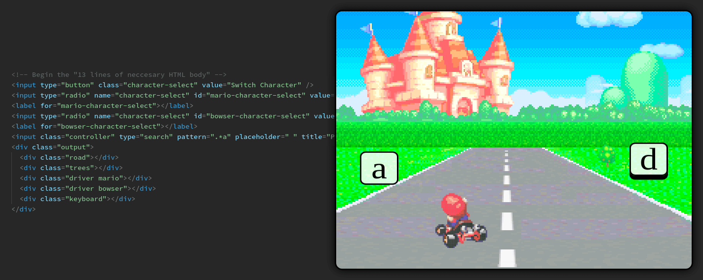
That’s why for my new Mario Kart knock-off game, I’ve logically decided against using JavaScript at all. To be clear, this is 100% CSS. My Photoshop licence ran out a while back, so this is:
- 0 images
- 0 lines of JavaScript
- Just 100% CSS
- (okay fine, and 13 lines of HTML)
You can control the racer using WASD controls. So how does it work? Let’s break it down.
Racers
A cool thing that the CSS spec allows you to do with box-shadow and linear-gradient is to specify an arbitrary number of points. This is useful if you wanted two or
three gradients, or to create some very basic CSS shapes.
It’s also helpful if you wanted to manually specify every individual pixel of an image… one-by-one… in order… directly into your stylesheet… until eventually you have the original image stored in your source file!
I actually got this idea from reading Alcides Queiroz’ great post on creating a Pure CSS Super Mario animation.
You might argue that this is absurd, has a much larger data cost than even the most naive image encoding, without even going into the implications of putting image-data into source files. And I might ignore your argument, and continue to speak, but slightly louder.
Doing so allows us to create our racers, like below:
Driving
CSS is intentionally designed to be minimally interactive, so getting a kart that changes direction depending on keyboard input is a challenge.
My initial thought was to have an <input type="text" />, and have some selectors like [type="text"][value="foo"].
Tim Carry gave a great talk on a Pure CSS search engine (with equally horrifying CSS). He used a very similar
idea to drive his dynamic search results. The only drawback to the idea is that it doesn’t actually work. value isn’t set when you type — it’s only the initial value that you can see in CSS. To get around this, Tim used 1 line of JavaScript to set the value on input change.
This is a fine workaround, and I certainly can’t fault Tim for it. In fact, I would have loved to have used the workaround. Unfortunately, I accidentally disabled JavaScript on my browser a few weeks ago, and still haven’t worked out how to turn it back on.
So I needed something that CSS did respond to, with no JavaScript workarounds. After a few hours of searching around,
I finally found a pseudoselector that looked to be of use — :valid.
An input with a pattern specified has the corresponding :valid and :invalid pseudoselectors. This gives us 2 states to play with. Along with the :placeholder-shown selector, which tells us if the input is empty, we have 3 total states. Empty (middle), valid (left), and invalid (right).
So with a giant invisible input, we get an interactive page that responds to left-right input.
Animation
Once able to respond to left/right input, we need to get the racers to actually turn left or right.
We can do this by making 1 big racer image, made up of each frame of the “turning” animation. This gives us our sprite, like the following image:
This allows us to then specify a manual keyframe animation, going through each “frame” of the image.
Racer Select
My brother always takes Mario when we play together, so I needed to be able to pick another racer. I picked Bowser because I respect how he’s not afraid to fail repeatedly at a task, despite not having a clear end-goal.
To make the selection menu, we can make some radio inputs
representing each racer. Our output should then show a different thing
depending on which input is :checked, using the sibling
combinators +, and ~.
Toggle Menus
And lastly we need a way to be able to “toggle” menus as either open or closed.
I was originally planning on having the menus just be permanently open — but this isn’t great for small screens, and my mum insisted on having the game on her phone so she could show her friends “how grown-up he’s getting”. So toggling menus it is.
We can do this by listening to the :focus of whichever button you
want to open the menu, and then allowing that button to lose focus when you want
the menu to close.
Conclusion
In case it wasn’t painfully clear when I mentioned injecting pixel-by-pixel image data in your stylesheets, allow me to emphasise: please don’t do any of these things.
This is mostly a thought experiment to see how far CSS can be pushed when you don’t have to worry about peer reviews, or your peers’ respect.
But do follow me on Twitter, and share this if you enjoyed it!
And keep an eye out for my next instalment: Converting Your webpack Config to be 100% CSS.